Tech/Skills
- Python
- Matplotlib
- Product & visual design
- Football data domain knowledge
Summary
Twenty3's data visualisations (largely pitch-based) work within the 'Toolbox' product, which is designed to offer maximum flexibility to a userbase that spans social media to analysts in football organisations. I have generally led the development of these visualisations.
Each type of visualisation need to feel neither too overwhelming nor too narrow. Added to that, the underlying technical architecture usually needs to work for multiple data providers which the Toolbox is configured to be able to use.
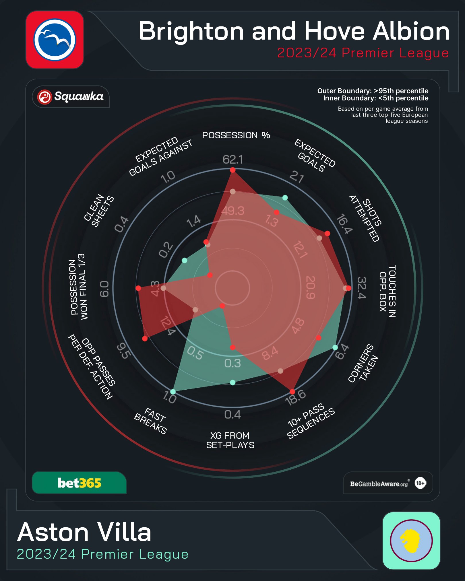
A good example are radar charts (see below). Popularised by StatsBomb, and introduced to the Twenty3 Toolbox in summer 2020 these needed to offer the option of selecting a variable number of (custom selected) statistics, against a variety of contexts (e.g. strikers or midfielders), visually appealing as a default, and with different visual options available if required.

Learnings
Working with designers
I have a lot of experience with football data and visualisations, but working with professional designers has been a fantastic bonus. The same is true for working with product managers. It's led to a clearer, more refined, and more visually-appealing set of visualisations, and been a good experience in when to hold firm and when to let go of certain ideas.
People like the tangible
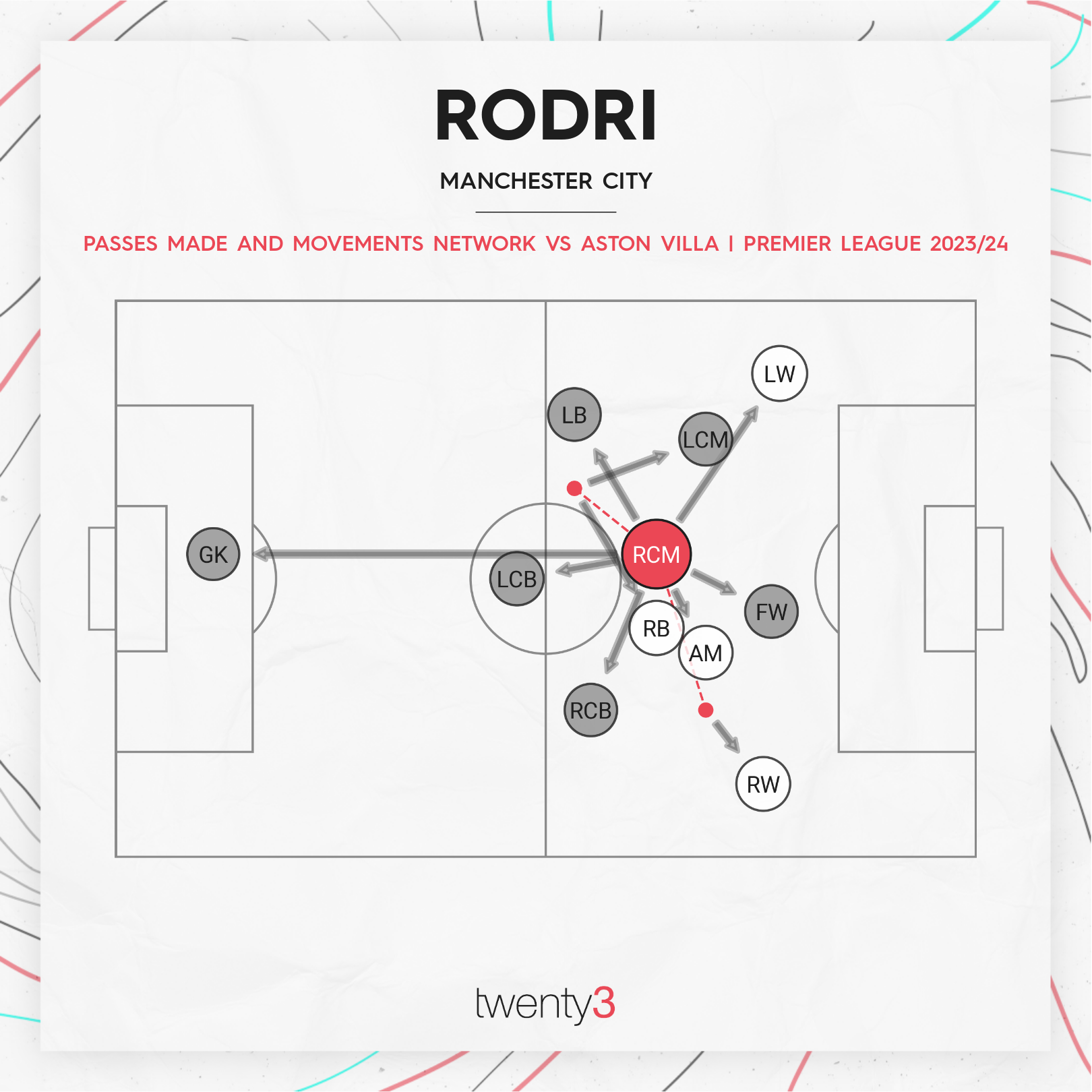
When the success of visualisation types has surprised me, it's often been because there's a tangible-ness about the visual. Two clear examples are touch maps as a preference to heat maps, and touch maps filtered by specific zones of the pitch (even though you can see the touches in a specific zone without filtering, people like to only focus on what they're interested in).
A slightly different version of this can take place with statistics. If people can't relate to/imagine what a certain statistic looks like (e.g. '3.5 tackles per game'), they will often prefer a rating for the general category (e.g. '7/10 for defending'). Working across the broad range of audiences that Twenty3's products span has given me an interesting insight into different versions of this same, recurring theme.
Visual hierarchy
If there's one through-line of Twenty3's visualisations, it's that they (should) be clear at a glance what the story is. In some cases, that's by letting additional information be available in filters or optional parameters; in some it's achieved through colour and shape choices; in some, by consistent boundaries.
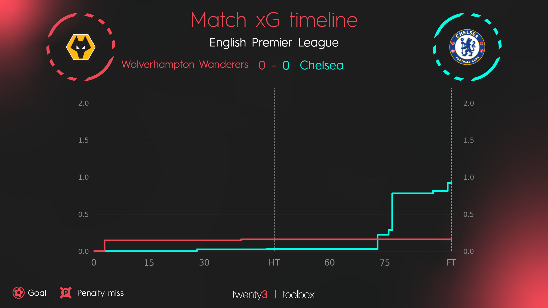
One of my favourite examples is in this last group: in expected goals timelines for matches, we used a 'minimum ceiling' so that matches would look fairly consistent at a glance. Matches where neither team created a high expected goals value would be instantly recognisable as such.

The visual hierarchy here effectively treats the negative space as a volume, the reader seeing a '0-0' scoreline and then emptiness. They know what type of match it was without having to read any values on the chart.
Deeper dive
Although I have been the primary developer of Twenty3 visualisations since 2019, most of the technical infrastructure was set up before my involvement. The programmatic way that filters and parameters can be added, without front-end code specific to different data providers, isn't something I can take credit for.
Equally, a large part of the power of these visualisations comes from the save-able mappings feature of 'Smart Graphics' in the Twenty3 Toolbox. In many cases, the powerful (though numerous) customisation options only need to be engaged with on set-up of a Smart Graphic - many users get the benefit of the customisation without being required to work with it. If this wasn't the case, the visualisations would undoubtably be approached differently.
I've come to think of visualisations as mini-products, or sub-products, in themselves. The flexibiltiy and customisation are features, meaning that developing a visualisation without these feels like a wasted opportunity. Better to take the time to develop a fully-fledged mini-product than rush to replicate a shallow copy of the latest visualisation trend.
Another aspect of these visualisations is to what extent they, and the default parameters that are set, are 'opinionated' in pointing users towards particular uses. For example, in analytics circles penalties are usually taken out of players' statistics ('non-penalty goals' and 'non-penalty xG') - so should shot maps remove penalties by default?
I think that the approach I've settled on could be defined as 'as much as necessary, as little as possible'. An example of this would be touch maps. When using the visualisation outside of a Smart Graphic (where the choice will have been set up for specific use-cases by the organisation), the choice of touch defaults to all on-ball touches players. However, for teams it defaults to a specific type of event, in a kind of nudge that all of a team's touches will likely be overwhelming and an example use-case that might be more appropriate.
