Tech/Skills
- React
- Tailwind
- Web design
- Communication
Summary
I made this site...
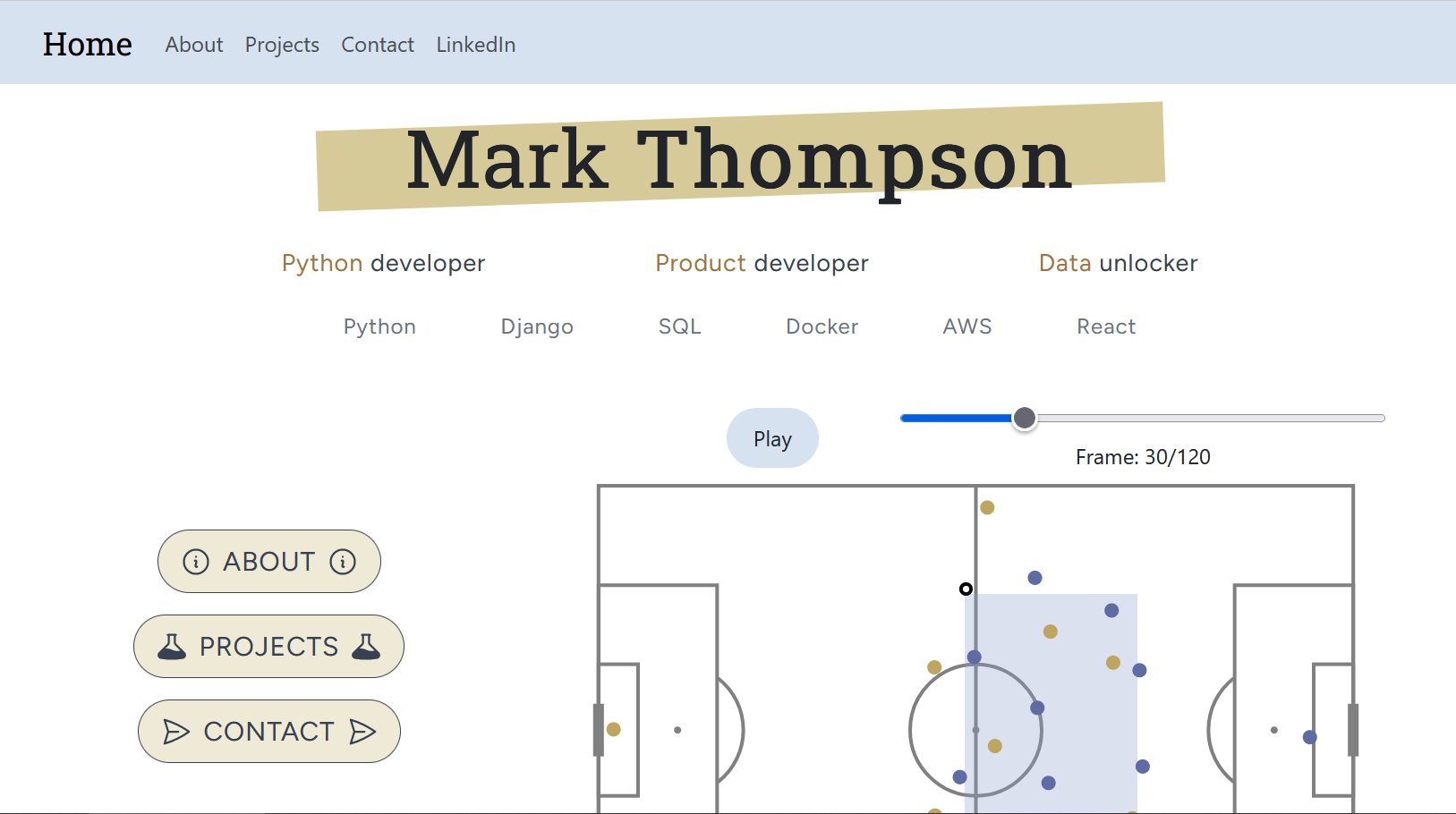
I set up a version of a personal site when first dipping my toe into front-end development in summer 2023, hosting it using Github pages (which it still is). I redesigned the landing page and project pages to make it look better, be better to navigate, and better reflect my skills.
Learnings
Web design isn't easy
This was my first project dealing with a website-like system which (should) work nicely across different device sizes. Using Tailwind CSS helped quite a lot, feeling more intuitive for me to use from my starting point. This was a steep learning curve technically and in terms of what looks good on the screen compared to in scribbled sketches.
Deep dive
The pitch animation on the landing page is a transplant from the 'build-up debug' app project. The colour scheme comes partly from coolors.co and partly from UI colors.
The highlighter text effect behind my name may well be something that actual web developers would recognise instantly, but was something that basically came from ChatGPT collaboration.
I think that, while the site is quite clearly a case of 'not a web developer trying their hand at web development', it's a significant upgrade of what was created just 11 months ago.
